
"What's Cooking?" is a multiplayer asymmetric cooperative game where players must serve hungry customers in an out of the ordinary kitchen. Ingredients and serving plates come out on two separate conveyor belts, chefs need to grab what's necessary before it's gone. With all the mayhem, communication is key. Players must balance the wants of their customers, the feedback from their fellow chefs (whether they be AI or human), and the speed of the conveyor belts. Ultimately, players must serve all of the customers with as few mistakes as they can.
UI/UX Artist
1 year
Erik Harpstead — Faculty Advisor
Jiaqi Zhang - Software Engineer
Patrick Huang - Software Engineer
Stacey Cho - 3D Modeling
At the time of this project, AI was still an emerging technology. ChatGPT had just come out and the thought of an AI team member seemed far out of reach. However, considering the potential benefits of having an AI team member, a question arises: How would be the most effective way to communicate with them? We wanted to explore how we can facilitate effective communication between human and AI players.
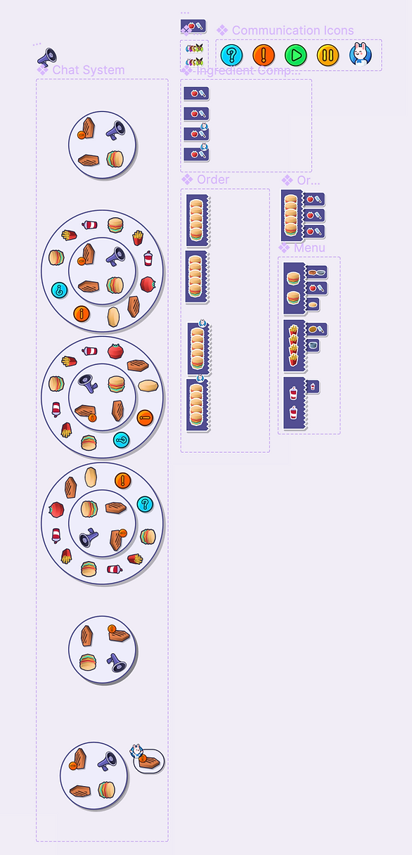
Wanting to keep the subjectivity of language while still making it easy for everyone to understand, I created a symbol-based system that would make it easy for both players and AI to communicate with one another. Given the time-sensitive nature of the game, quick communication was important, so using symbols instead of words made it much easier to communicate.
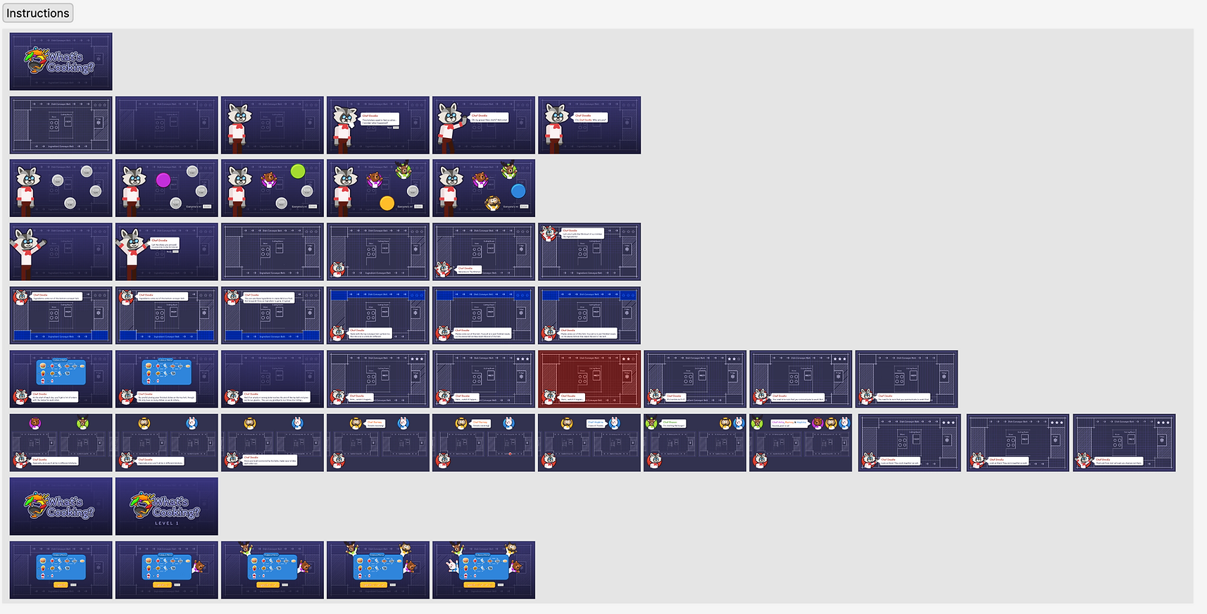
In order to make the game more approachable, I created a tutorial which would be shown to players the first time they play. I took inspiration from JackBox games, which uses fun characters and animations to explain gameplay. The creation of the tutorial also helped for the team to iterate on mechanics and iron out a final rule set. Ultimately, my goal with this tutorial was to make it easy for players to jump right in.
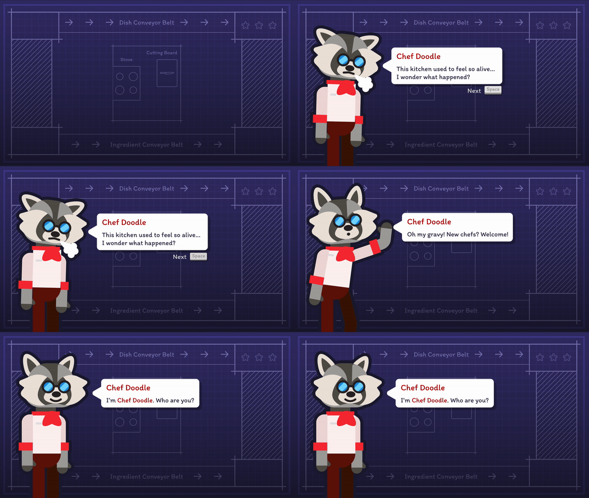
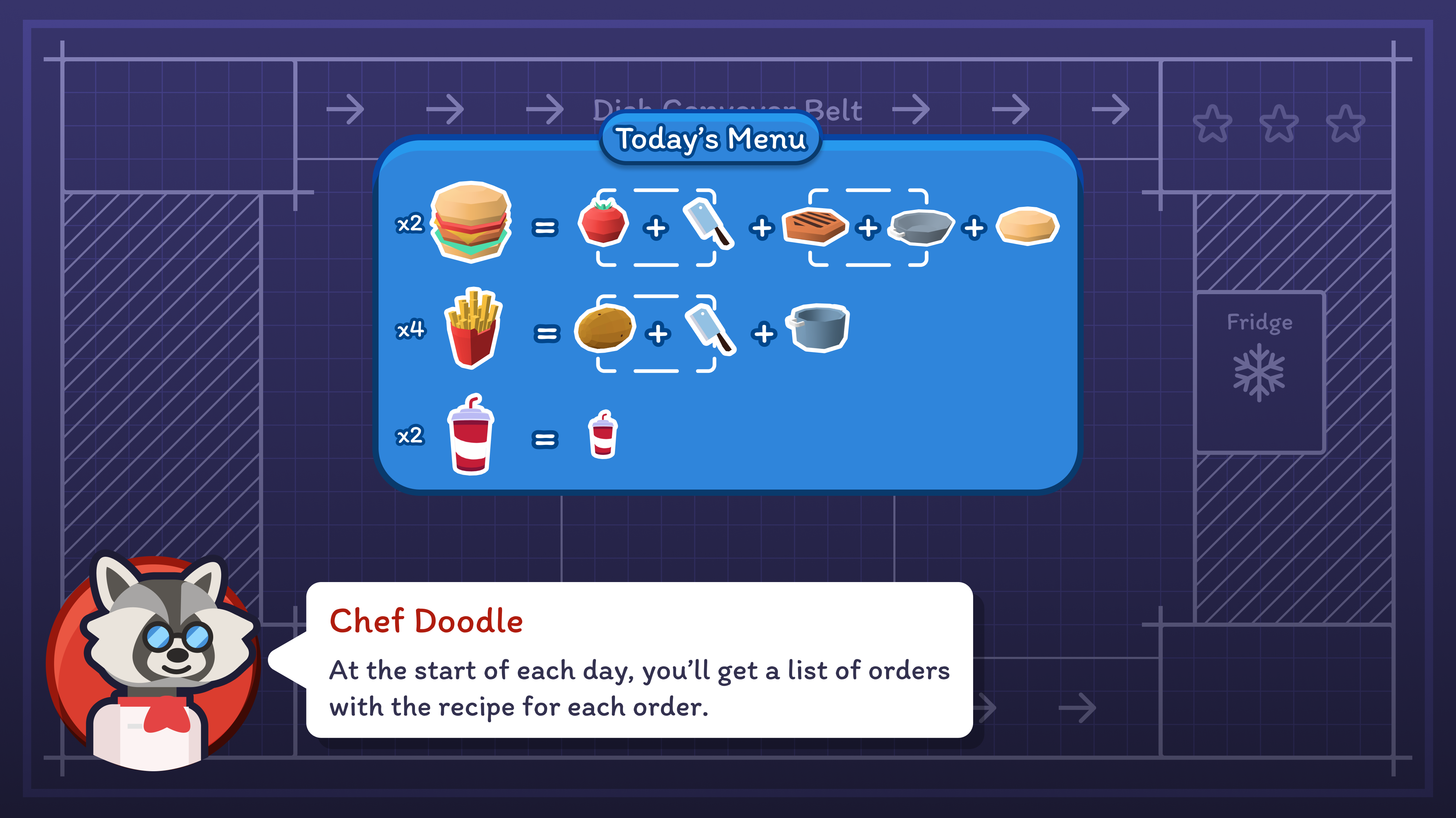
At the beginning of the tutorial, players meet Chef Doodle. To motivate players to work well together, I task players with a mission: rescue Chef Doodle's failing restaurant. The gamers turned chefs are his last hope. To heighten the emotional impact, I introduced a range of expressive emotes for Chef Doodle. These include happy, sad, interested, and neutral expressions, providing visual cues to complement his dialogue.

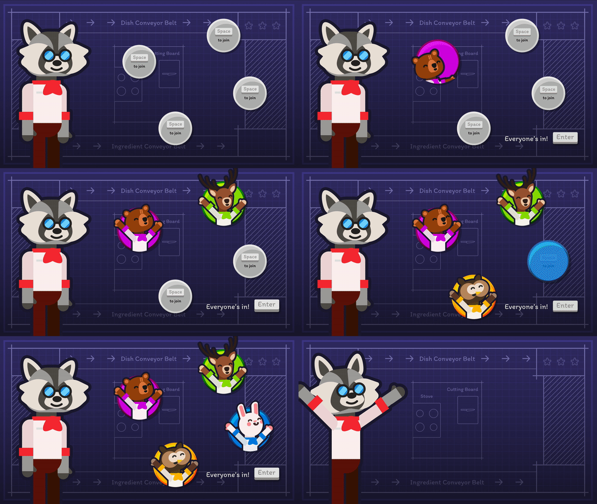
In order to establish their input device, I created a join game screen so that players can select both the control they plan to play with and the character that they want to play as. In total, there are 7 animal chef types to choose from. Regardless of whether the player is human or AI, everyone plays as an animal because this felt like good neutral ground between human and AI.
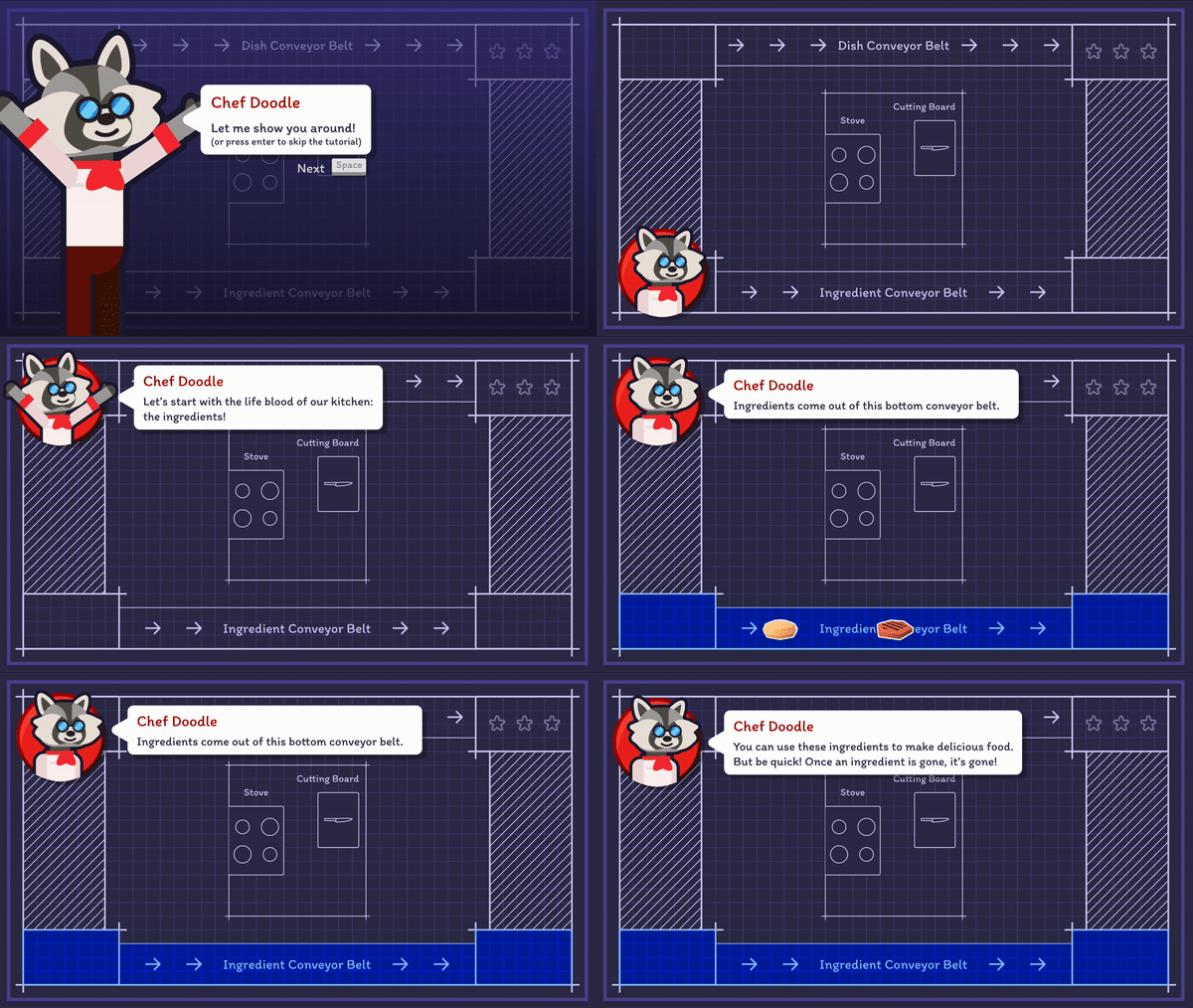
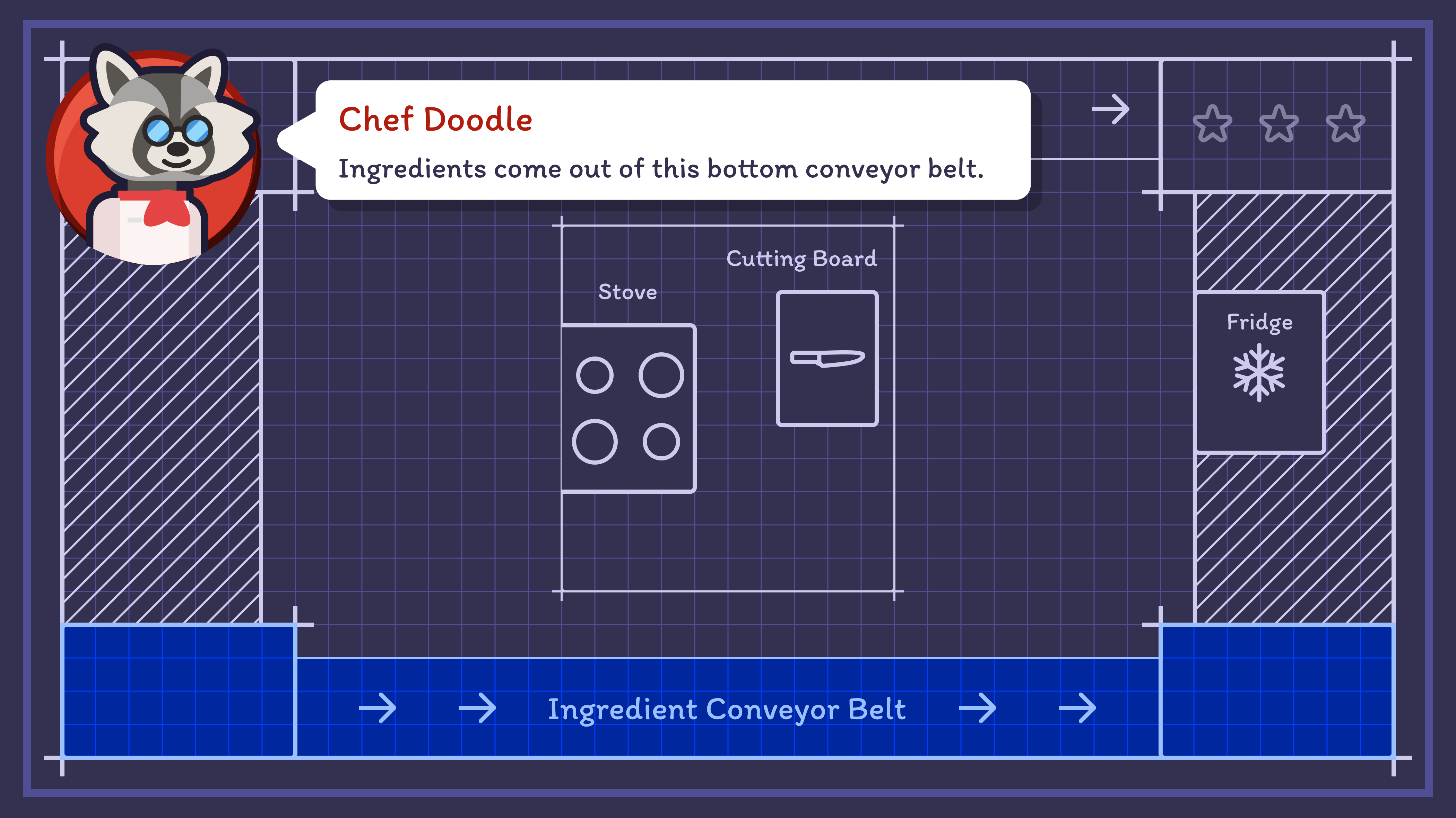
During player interviews, I found that the conveyor belts were the main component of the game which confused players. In order to ensure that their function was clear, I created an animation to show how they work. This seemed to help players understand how this facet of the game functioned. In previous iterations of the tutorial, only the conveyor belt region was highlighted. This made it more difficult to understand.
Food 3D Models by Kenney
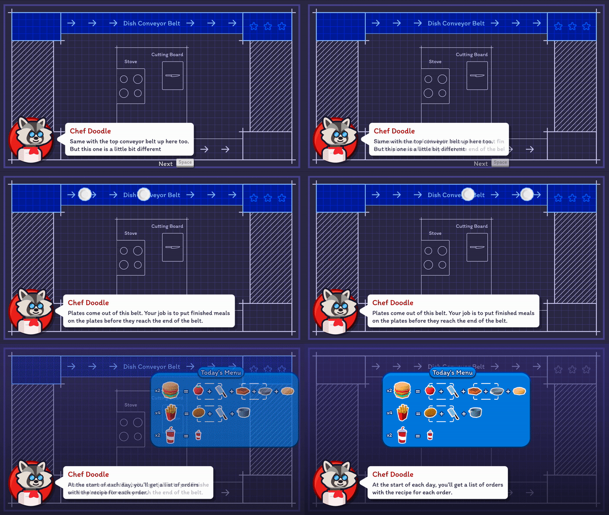
In addition to the Food Conveyor Belt, there is also the Dish Conveyor Belt which players place finished food on to pass it between kitchens and ultimately to the end of the level. Dishes cannot be removed from the conveyor belt.
Dish 3D Models by Kenney
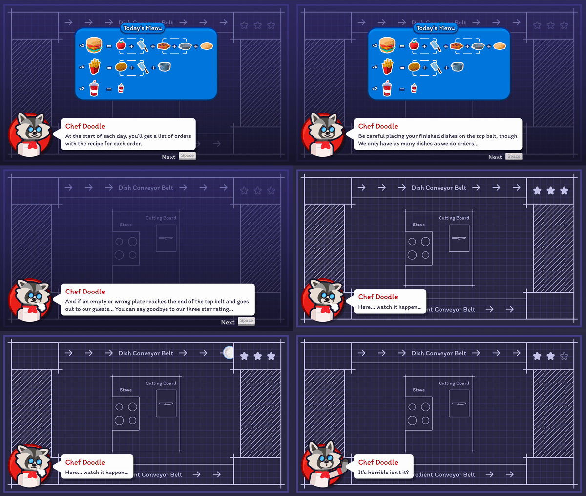
Since the conveyor belts are the primary way players can accomplish their win condition, finishing all required meals, I thought it was important to show the players how they can lose. Players lose when three unfinished or incorrect dishes makes it to the end of the conveyor belt. I showed that failure would make Chef Doodle sad to persuade players to do their best.
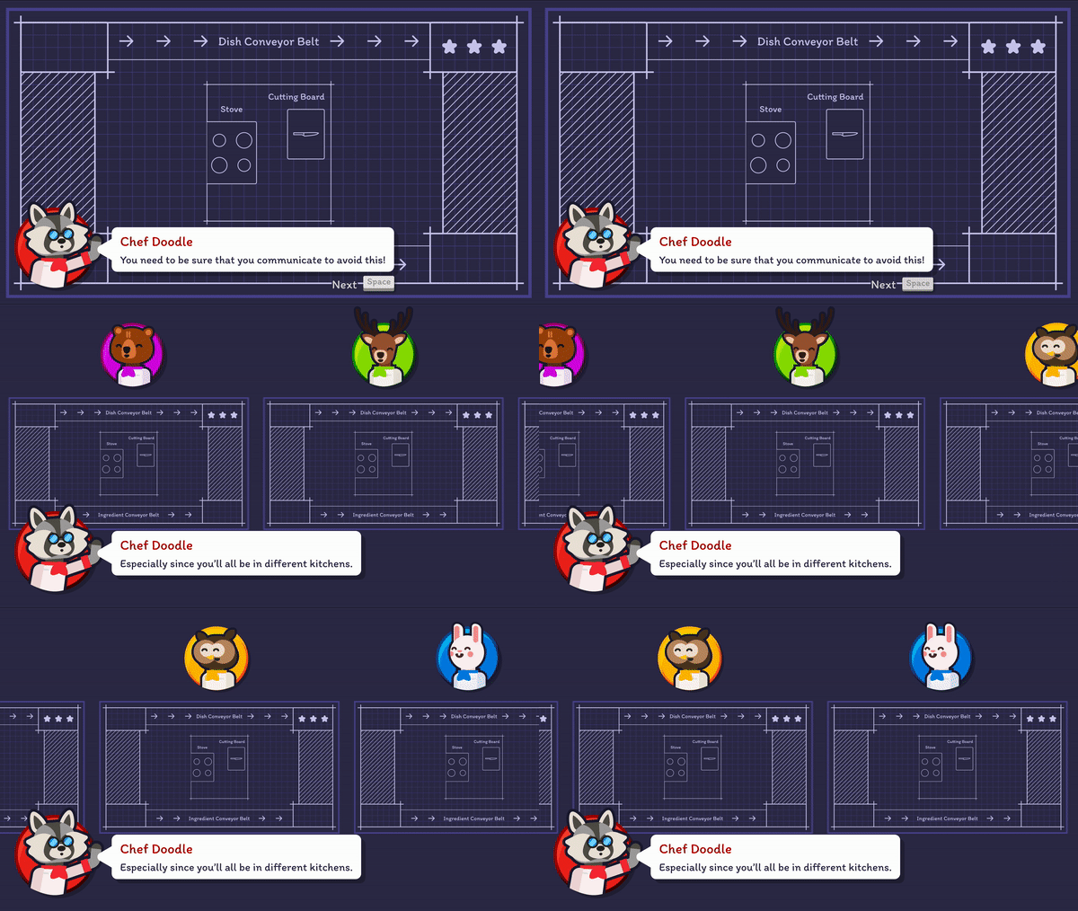
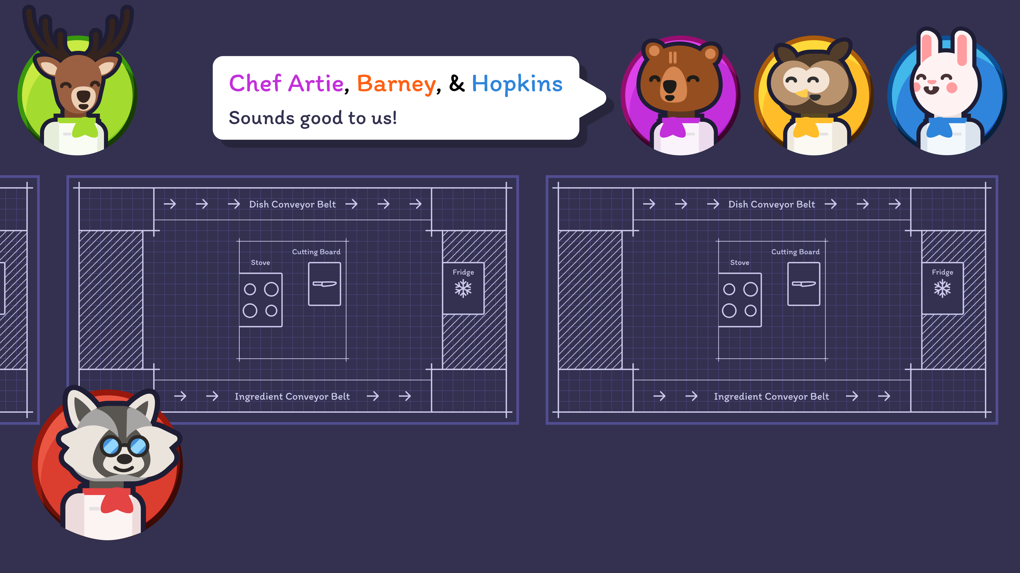
Another aspect of the game which often confused players was how the kitchens connected. Since the kitchen layouts could vary between levels, I thought it was important to show players a sample layout. In this example, the kitchens are in a line connected by the dish and the food conveyors. The zoom out effect significantly improved player understanding.
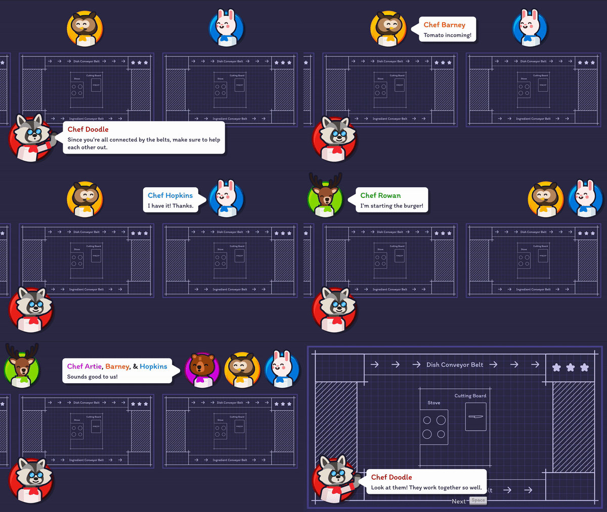
As well, it was important to show how communication between players would look. This visual aid would help players to understand basic things they could say to one another to ensure that they achieved the goal.
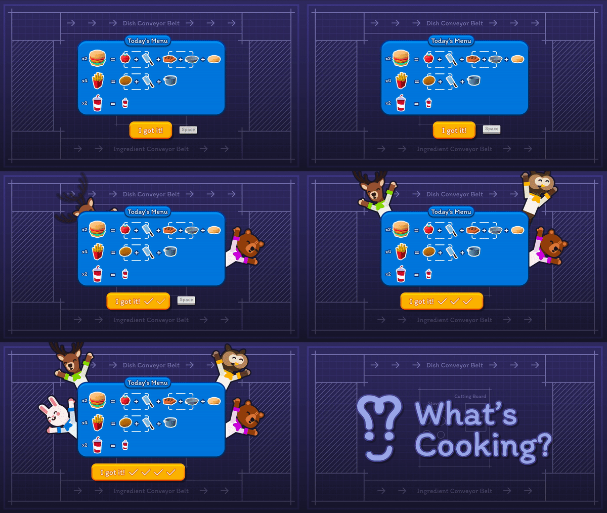
Each level has a certain number of dishes which the team must successfully complete. However, there's a limit of three mistakes allowed before the team loses. To help players in preparing for the level, the orders are displayed prior to each level. This pre-level period also serves as debriefing time, enabling the team to strategize and assign soft roles like "I will work on hamburgers."
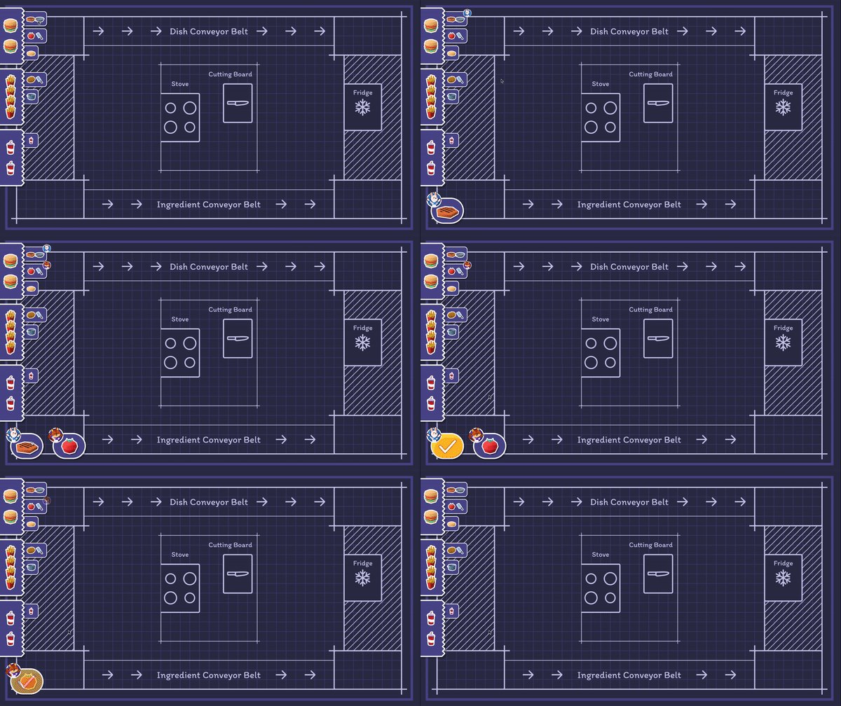
Since this game involves both AI and human players, I wanted to maintain
the unique subjectiveness of human language while still making it easy for the AI to understand.
I created a system where players can click to show what task they are doing. This information
appears on the screens of other players, so everyone knows what's happening. Clicking again
indicates that a task is finished.
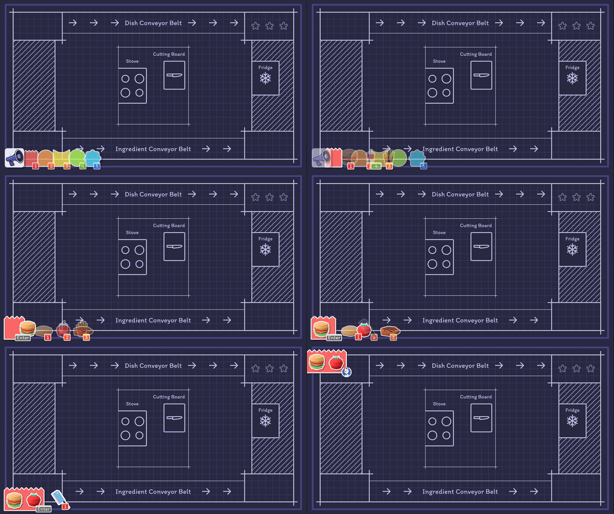
In the first version of this screen, I tried using different colors in a kitchen-note system to show how urgent certain tasks were. For instance, red indicated something was very urgent. However, after testing the game with real players, I found out that they didn't really feel the need for such explicit urgency cues. They just wanted to get the items they needed without any extra complications. Taking this feedback into account, I refined the prototype to make the process simpler, focusing on straightforward item requests.
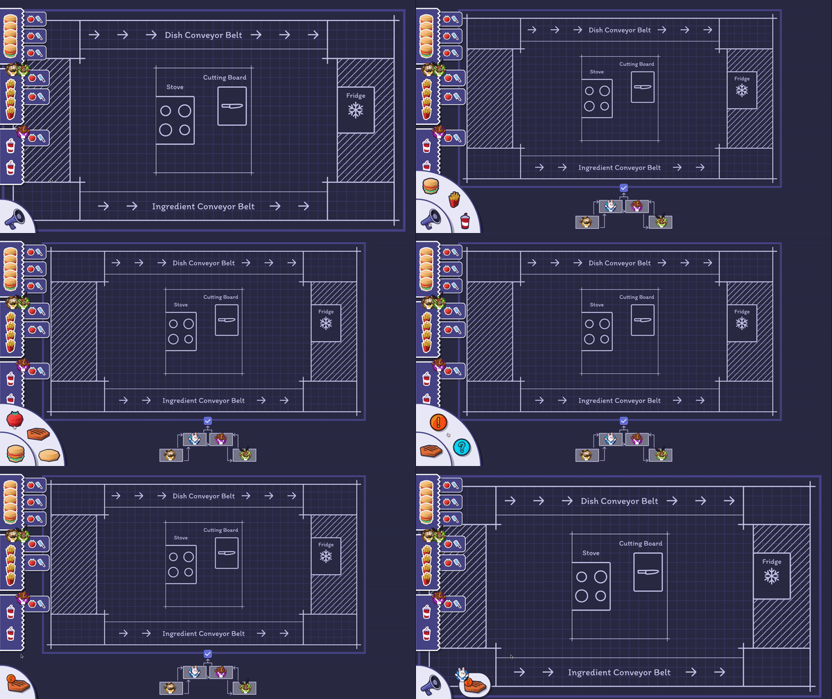
In the second iteration, I decided to simplify the urgency system to just
two distinct states: a "!" to indicate urgency and a "?" to represent a request for item
location. However, during playtesting, I noticed that players often used these two communication
points in similar ways, resulting in confusion and misinterpretation.
I also considered incorporating a spinning wheel to reduce the space the communication system
took up, which would allow players to quickly indicate the specific food they were referring to.
This change was aimed at making it faster and more precise. Additionally, I introduced the
concept of a map within the communication system, giving players a visual representation of
their position within the kitchen system.
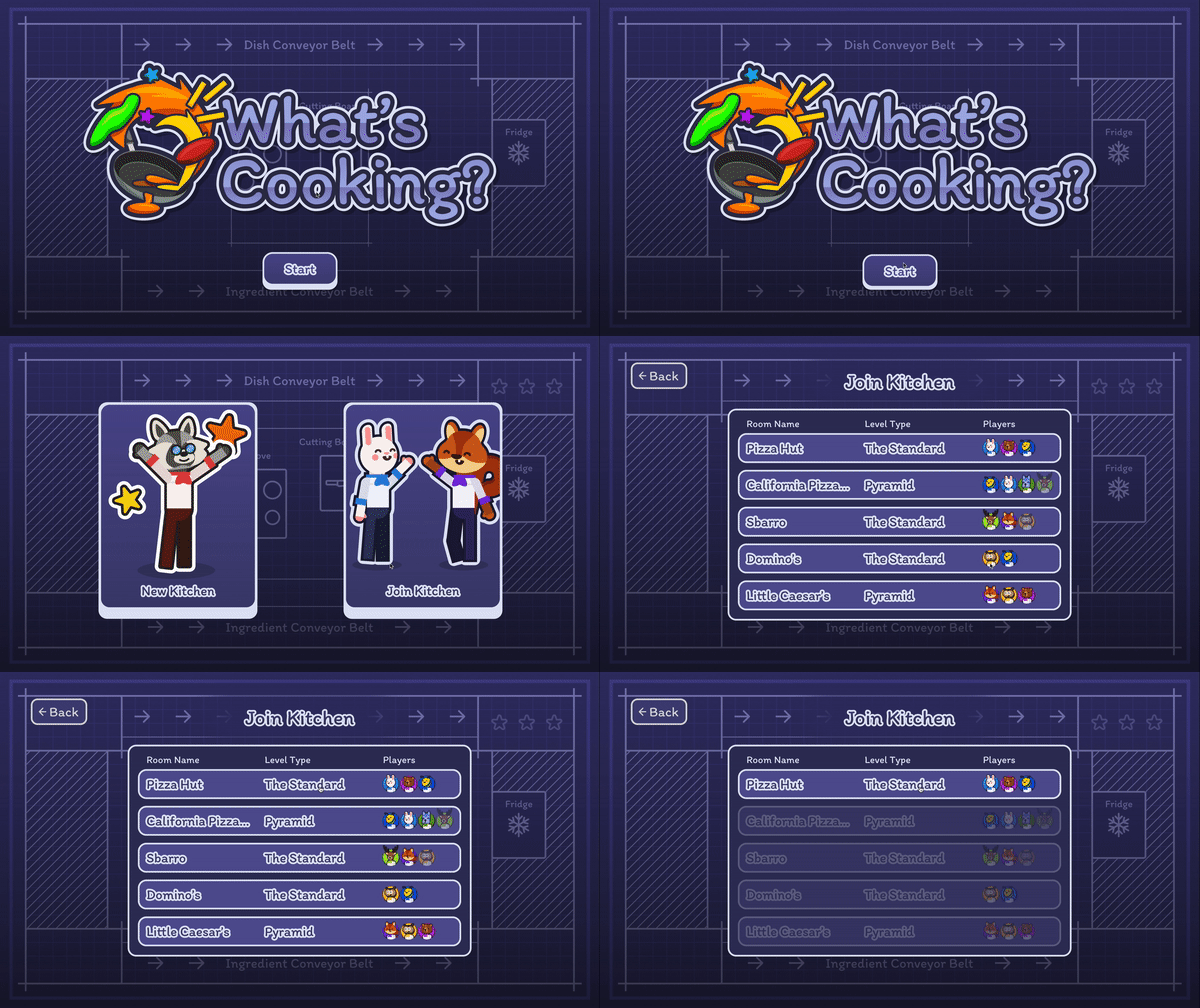
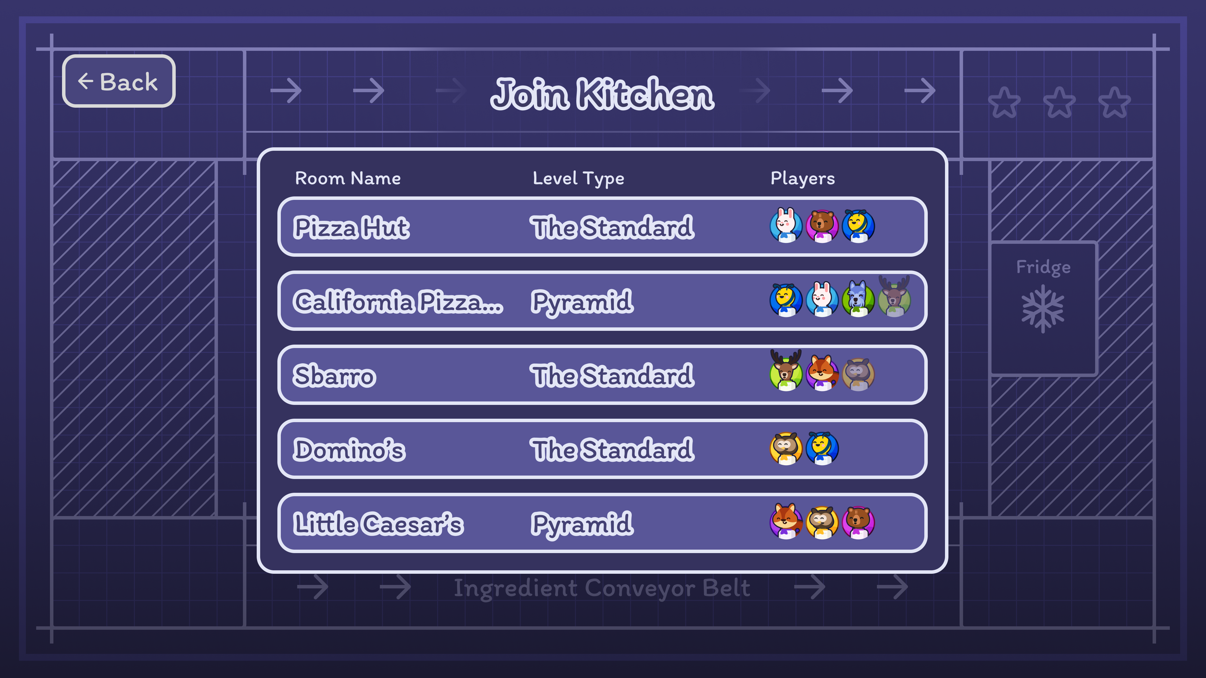
The main menu screen lets players choose to join an existing kitchen or create a new one. To make this choice clear and fun, I created two simple illustrations, one for joining and one for creating. With these visual cues, players can easily tell the options apart and go where they want to.

When creating a kitchen, players pick a room name and select the number of players. I wanted for this process to feel straightforward, so the elements change colors and enlarge to show that they are selected.
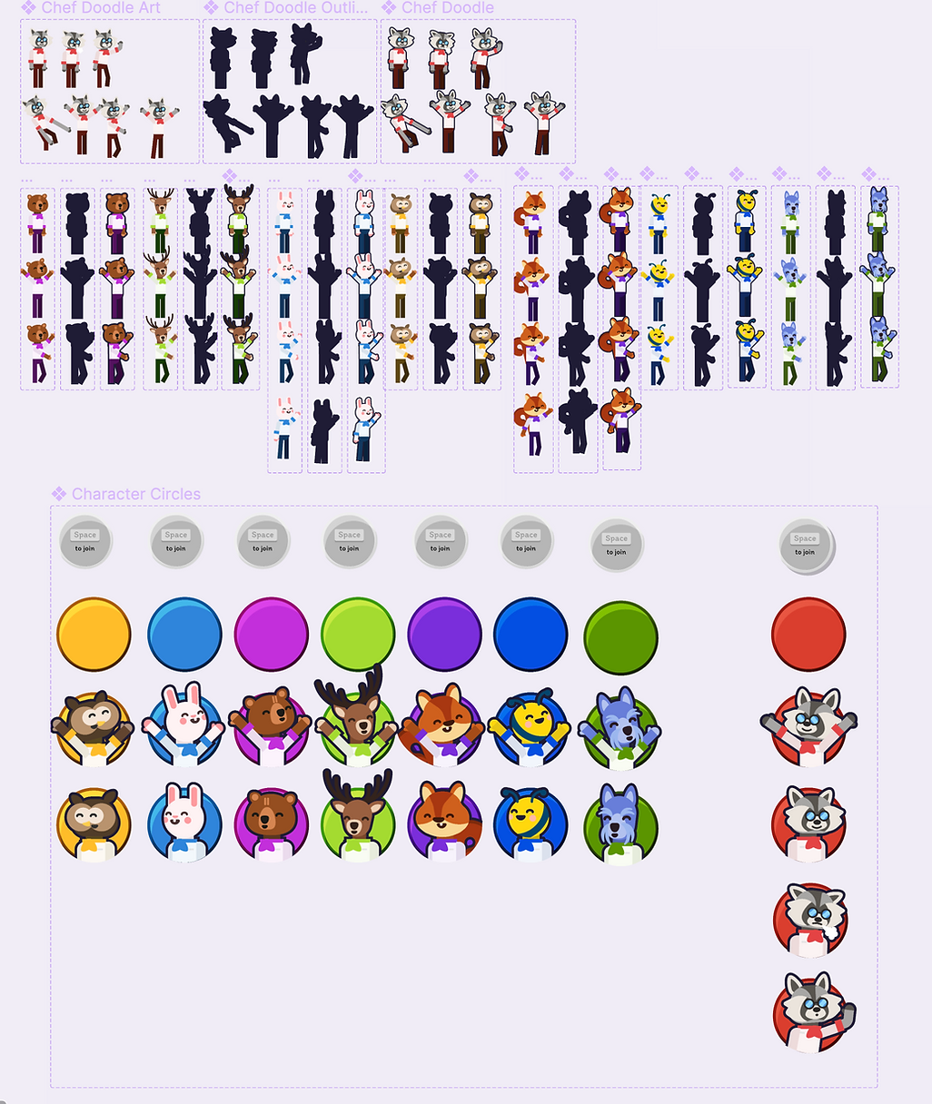
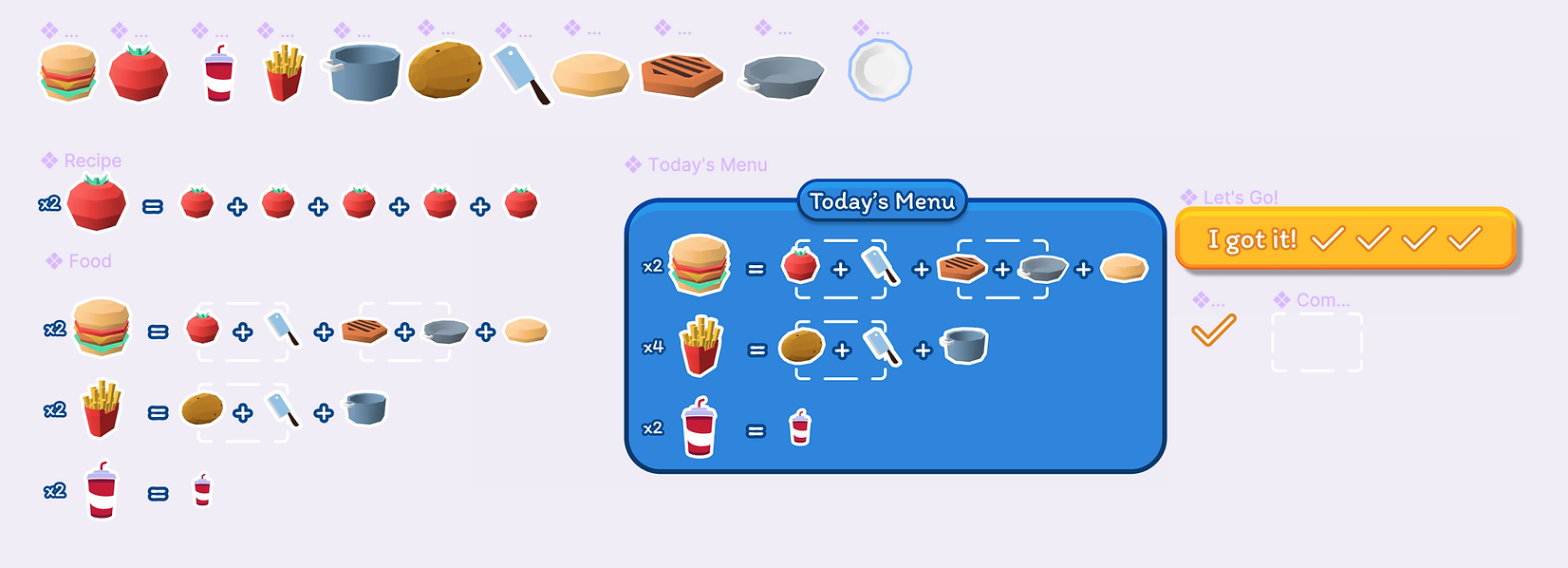
My goal was to ensure this file is user-friendly. I organized components and variants so that elements can quickly be changed. All assets were exported as sprite sheets and made available on a shared Google Drive for the convenience of developers.
